Usability
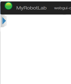
I was thinking and analyzing the usability of using the mouseenter and mouseleave to open the Sidenav and there may be problems when using a touch screen and you could not use onmouseleave to close it.
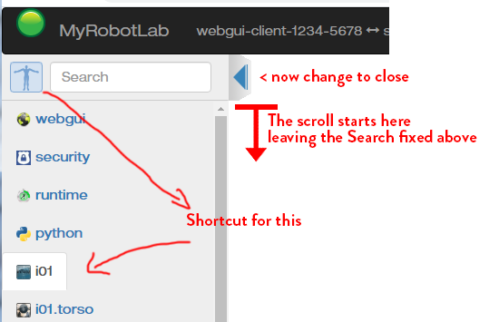
So taking that into consideration, to open you have to have the two methods onclick (for touch devices) and onmouseenter. And to close it has to have a button for onclick (for touch devices) and the whole panel can have onmouseleave too, but we have to test how onmouseleave behaves on touch devices, in case there is any conflict.
Before moving forward I wanted to show you what you think of this idea to see if I continue or not.

.png)


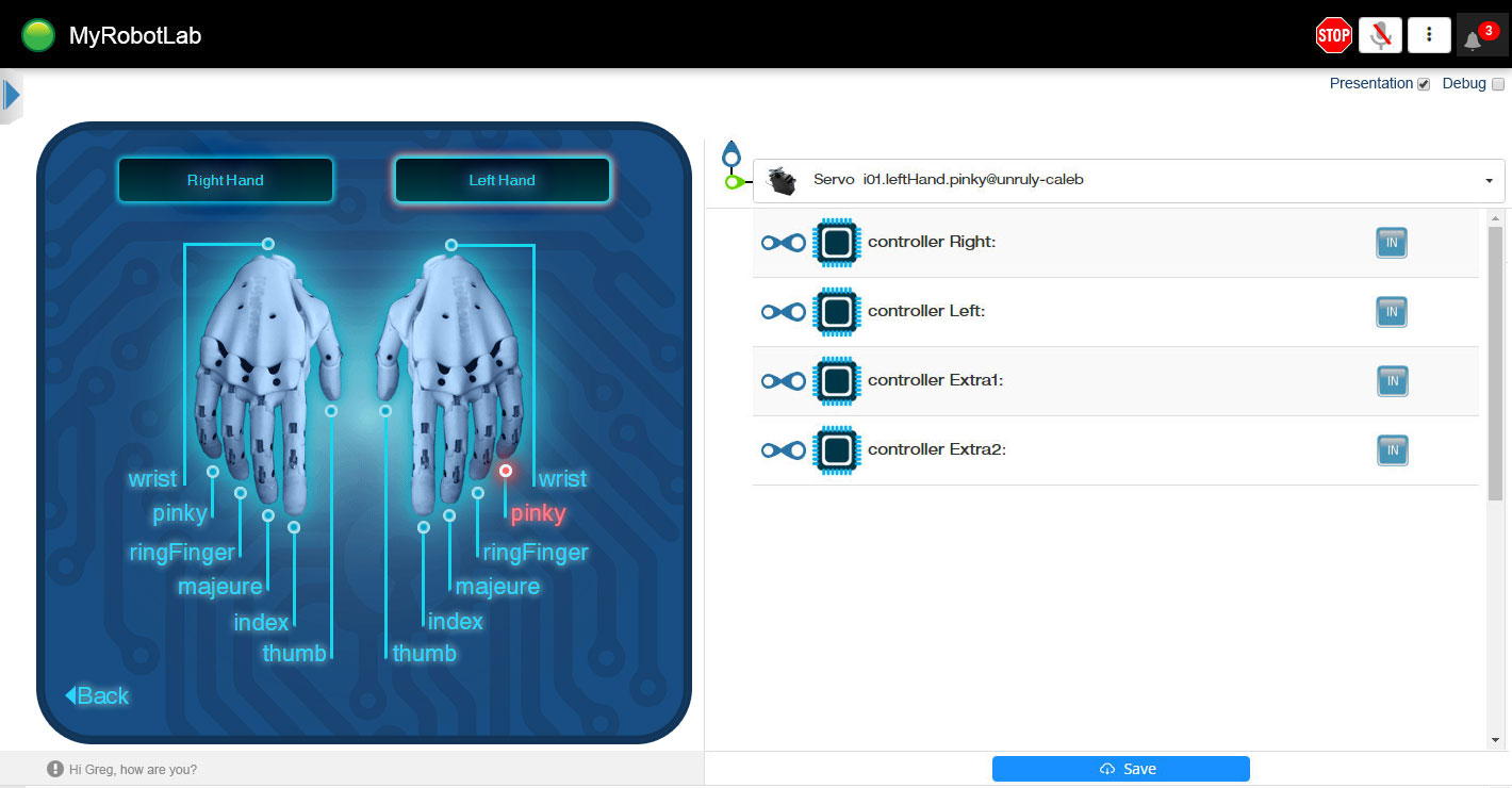
I was thinking that we can have by default a Presentation View with the main elements, more clean. With the errors indicated as notification in the bell and you can open them to see.

and an option to activate with a checkbox (Debug View) that shows more information such as breadcrumb and errors in a scroll window below.

But maybe it's complicating things too much.

Your progress looks great - I
Your progress looks great - I really like that your doing usability design vs just making it look great.
I have a cheap tablet I can test on when there is enough stuff to test.
It's shows me that the webgui js client is connected to the webgui server :)
Your welcome to remove all of it except I'd like the version to remain, at least through our development period before release, because its the one stable indicator of what is being displayed.
I like it clean, but please at least for development and testing keep the version viewable, it will save time when helping one another.
I thought the bell on the right side with badge and counts was ok + a "settings widget or hamburger"
The bell would bring down a panel, similar to azure where once viewed the counts would reset.
Do you think this is a bad design?
I don't think the breadcrumbs currently add any value.
I sent you a link to a google drawing doc - https://docs.google.com/drawings/d/1msnlm8daBdgZIXN8nT363qHlahgR-ZNrvXEAK6tKFE0/edit
just in case you might find it useful to discuss changes. The nice part about it is multiple people can edit it at the same time.
>It's shows me that the
>It's shows me that the webgui js client is connected to the webgui server :)
>The bell would bring down a panel, similar to azure where once viewed the counts would reset.
Perfect!
>I don't think the breadcrumbs currently add any value.
Better!
Hello Guys, I just tested the
Hello Guys,
I just tested the latest. I like the new buttons on the top bar, specially the one for to stop MRL, handy!
I also enjoy having the sidenav push onmouse enter. But I don't really like that it has a onmouse leave.
It is usefull sometimes to keep the sidenav to work side by side with the UI.
I noticed some strange artifacts related to the error being displayed on the top (I really think they should be displayed under the UI.(That's a personal feeling)
Also noticed that all scrolling bars are too thin, that we can not handle them on a touch screen.
I'm working on the errors
I'm working on the errors push down things when they shouldn't..
it will be a bell notification, with number of errors
and when you click it - it will show a panel of all problems, warnings and info - then close it and the counts go away
much less invasive than current behavior
Hi Gael! I just tested the
Hi Gael!
I just tested the latest. I like the new buttons on the top bar, specially the one for to stop MRL, handy!
Good!
I also enjoy having the sidenav push onmouse enter. But I don't really like that it has a onmouse leave.
It is usefull sometimes to keep the sidenav to work side by side with the UI.
Yes, I was thinking that at some point it would be nice to have it open, I thought I could add the functionality to pinned or just remove the onmouseleeave as you wish.
But it seems better to remove it (onmouseleeave ) and use only the X. Less issues.
I noticed some strange artifacts related to the error being displayed on the top (I really think they should be displayed under the UI.(That's a personal feeling)
From what I understood Grog was already working to put them in a window, that's what the notification bell is for. Only the number of notifications will be seen on the red badge until you open them.
I am going to try to make the window now, but the functionality has to be done by Grog, I don't know how to do the message count and have them deleted, all that is Angular.
Also noticed that all scrolling bars are too thin, that we can not handle them on a touch screen.
You don't need scroll bars in touch screens, just drag the content. I just test it in my phone and works.
I just realized that for touchscreens the button to open the sidenav must be bigger.
I think we should put a name for a beginner to understand, like Main menu, Control panel, Chocolates, something more understandable. SideNavbar is the internal name, but I think it deserves something that says "Hey, here is the droid you are looking for"
How about something like this? In this way we have a larger area to click for those who use touch screens. I just made a simple design so that the concept is understood you can design it to your liking.
With occupying the width of the green LED in the header I think it would be fine for a finger.
I replace the power off with
I replace the power off with a bootstrap glyphicon and the bell too .. I'll replace the 3 dots too..
I replaced the multiple classes with a bootstrap badge class (currently a hardcoded 5 exists)
We should use bootstrap glyps when we can, as its a part of mrl's webgui (its already packaged with myrobotlab.jar)
here is a list of glyphs
https://www.w3schools.com/bootstrap/bootstrap_ref_comp_glyphs.asp
those two items were created with the small amount of html and no new css
I changed the button to just
I changed the button to just be a class in the div ... an added the size and correct color with nav-icon class
now all 3 components come from bootstrap, are the same size and correct color for the nav bar.
The drop down component uib-dropdown is terrible, and always messes up alignment :(
So I think I have a replacement for it that will not be mis-aligned
looks better now .. i removed
looks better now .. i removed useless form tags in the html
More Clean ! (1) now only
More Clean ! (1)
now only the id (in this case called "admin") and the version remain.
I still have to place the badge over the notification.
Now most of the detail that was removed I put on the About page .. but its very ugly now :(
(2) the shortcuts are called "pills" i think and they jump around, I personally like it if they were columner - all in a single straight line with scroll bar if necessary..
Here is the current ugly About.
I don't know where to begin to start cleaning it up :P
It looks much better! I see
It looks much better!
I see if I can fix the sidenav thing
mis-aligned !
mis-aligned !
I think I was able to fix the
I think I was able to fix the sidenav and the Main scroll problem that the content overflowed and did not react until you resize the browser.
Wow all this is great visual
Wow all this is great visual improvments!
I just tested it and it has a nice feeling.
@Astro, I like your idea to have something like that, it could allow MRL webgui to have more content if necessary:
@Grog, nice job with the glyphicons. I still get the number tag "5" mis aligned in chrome, but it's strange because you seem to have it aligned in your exemple.
Maybe the extra shutdown is not necessary here anymore?
Maybe the "localhost:8888" could be moved somewhere less inconvenient?
Hello Gael. We can't move
Hello Gael.
We can't move that "localhost:8888" is the status bar of the browser.
What we can do is change the width of the sidenav border to 24px
border-bottom-width: 24px;
so it does not appear above the links.
The other option is to remove the href from the links which is what causes it to appear. And replace them by onclick.
Hello Astro, Great, that
Hello Astro,
Great, that seems the best option to reduce border-bottom-width: 24px;
Maybe the extra shutdown is
Maybe the extra shutdown is not necessary here anymore?
@Grog, nice job with the glyphicons. I still get the number tag "5" mis aligned in chrome, but it's strange because you seem to have it aligned in your exemple.
Fixed & Fixed
now it reports the actual number of notifications
and blank when empty
on webgui_work branch