Hello crew
This is the current programAB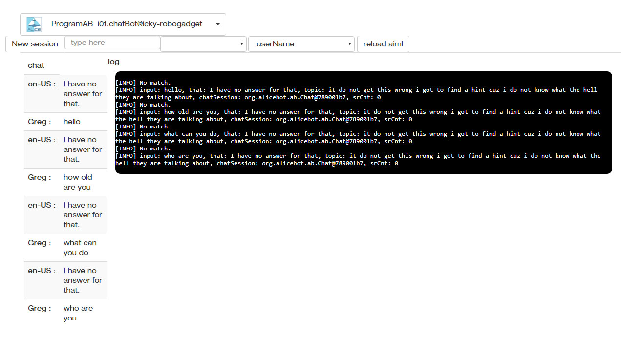
I was thinking about how to make the chat more friendly in conjunction with the log and I used Whatsapp web as a base.
I think more intuitive that it works chronologically from top to bottom as a chat. It is currently working in a strange way for me, the last message is being shown above, like in the shoutbox.
Many times I find it difficult to read down translating and then having to jump up to see the next message and again jump up to read the next, I find it very uncomfortable to read this way.
Everyone is used to reading naturally from top to bottom
But I understand that in this case that there is a log for you it can be more practical in the current form.
This is the first attempt, pros and cons, opinions, criticism?
Is it overwhelming? do I make it more minimalist?
What do you think of the location of the elements?
Here is the latest ProgramAB webgui
The Conversations tab ... probably should be renamed to just Chats:
Here is the Debug Tab:
The Awesome part of this - is you can click on one of the files .. and modify / save it in Edit:
This is what i see
This is what i see
Maybe try
Maybe try the https://github.com/MyRobotLab/myrobotlab/blob/develop/make_web_dev.bat in a new directory?
(No subject)
cool !
cool !
Currently it is very good, it
Currently it is very good, it changed a lot of what I saw.
There is very little in what I can contribute.

I would separate what is the Bot above and all that is of the human below.
Put a scroll in the description of the Bot that we are only going to read once and gain as much space as possible for the Chat, Debug and Edit, which seems to me to be the most space it needs for it to be practical to use.
Can this be opened in a modal to prevent it from stealing space?
Version 2

Version 3
Compressing the upper part even more
I like your v3. But I don't
I like your v3.
But I don't think human stuff should go at the bottom
I think it should go
Bot
Human
Chat
Good idea -> Put a scroll in the description of the Bot that we are only going to read once and gain as much space as possible for the
So #1 Human controls should go under Bot controls, then chat..
I don't really like the current editing of predicates & properties - so #4 button (and the edit pencil) might be able to go away - the folder or path is NOT editable, but I like your folder icon.
Reload Aiml - isn't there a reload symbol - maybe alt/title it "reload bot"
I don't know what "You can interrupt me at any time by tapping Speak button." text came from ..
but the bottom one "info human <-> Alice session does not exist" .. it should be put back at the top ..
the reason is because this is a "status" bar, and it lights up when important info comes to the user.. I was having a very hard time gettin ght Edit->Save button to work..
If saving fails the user gets a bright red "Could not save reductions.aiml" - which is very important, because the user spent hours editing .. you know how that is ;)
Be aware #2 - the grey human or the human with a ? ... when its all working correctly, at some point that person will be "you" .. that's why i initially made it the same size as the bot's face
very good!I don't know what
I don't know what "You can interrupt me at any time by tapping Speak button." text came from ..
I am seeing that floating under the "type here", it is the last phrase that says in the chat. I don't know if it's necessary or maybe that was just there to test.
In "human" there is also a hamburger,
it does nothing if I press it, I don' t know if it is in case I am hungry or it also has properties that should be in a Tab next to "Bot Properties". We have room for more Tabs anyway, like "User Properties".
Version 4
the bottom one "info human <-> Alice session does not exist" .. it should be put back at the top
OK understood. I thought it was part of the "Main error log and notifications" that Gael said should now go down.
The Awesome part of this - is you can click on one of the files .. and modify / save it in Edit
Oh! I just realized the magic of the EDIT Tab and that I can do this:
Ok Alice, get ready to learn bad words!
Be aware #2 - the grey human or the human with a ? ... when its all working correctly, at some point that person will be "you" .. that's why i initially made it the same size as the bot's face
Ouch!
Mmmmm..
That will take up a lot of space :(
I already know my face haha
I'm going to see if I can think of something else.
I don't know what "You can
I don't know what "You can interrupt me at any time by tapping Speak button." text came from ..
yes, I forgot .. its the last response.
Yes, its important, because I switch to Debug - and I like to see the response to what I type and decide to edit depending on what file created the response..
I see what #1 is after typing, then press #2 .. then I can add bad words ;)
#4 & #5 will get turned into tabs [Predicates] and [Bot Properties]. The human part/GroG will move belo Bot but above typing..
Path should get your folder icon and the edit pencil should go away, pressing on [ Predicates ] or [Bot Properties] will return an edit window similar to [Edit]
#3 cannot be editable - the folder icon is better than my "path"
Maybe the conversation table can look nicer like you demonstrated.
Hee hee, I am excited you started editing Alice - that means the Gui was at least a little successful ..
Initially, My or Your picture will not be there .. it will be an Unknown/Human picture..
but if OpenCV service is working and we have a recognizer trained, then the bot will be able to recognize you versus someone else.
If it recognizes you, then your picture and your "Session" and Picture (from OpenCV) should appear.
[Predecates] are all the things the bot remembers about you and your session.
So ... imagine .. servo scans..
OpenCV recognizes you ..
Starts Bot Session ... (Your Session - easy to confirm because your picture comes up) ..
And is ready to continue your conversation, or understand what you want, and remember how you trained it.
That's the general plan ... we are getting closer
it does nothing if I press it, I don' t know if it is in case I am hungry or it also has properties that should be in a Tab next to "Bot Properties". We have room for more Tabs anyway, like "User Properties".
Ya .. that hamburger would have been Predicates, but I decided against it .. and need a tab for it instead..
[Predicates] I learned are variables and things the bot remembers after a conversation with a specific user. We default the user to be "human" unless you type your name in the Session box and it will start a new session called Astro <-> Alice . The predicates I learned are saved in the path/config/Astro.predicates.txt - you start with whatever the default was (same as human) but there are questions and information you can give in the chat that will update these variables. I think a tab to edit them directly would be good too.
[Bot Properties] is a file located in path/config/properties.txt - and its the data related to the bot. It should have its own edit tab.
Your version 4 looks good along with what I suggested.
It is very impressive if all
It is very impressive if all that can be achieved, I am eager to try it.
What I'm thinking now is that I can train recognition with multiple photos of men for John Connor and multiple photos of women for Sarah Connor. So I guess he would always identify any man and any woman between those two names. That would cause a fatal recognition error in the case of T1 haha. Terrifying Skynet mode.
Thinking about how to use the minimum space, what if we put the 2 photos at the same height as in your version, but apart and use that space that gives the maximum height, for the rest of the elements?
Remove the description and "path" of the bot and put it in a modal that opens with a button More info? That way we can gain space.
I don't know if you need to see the "path" all the time for something else in the edit. In the modal you can put more information about the robot that you don't need to see all the time.
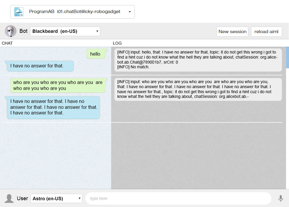
Apparently there is a standard in chats, where the person you are talking to is on the left and you are on the right. I see it on Whatsapp, Facebook, and in images from different chat applications looking for chat images in google.
Maybe the conversation table can look nicer like you demonstrated.
Here I made a version with chat balloons, without the names to see if it is clear and it is understood which side Alice is talking.
Version 6

Another thing I noticed is that the name John Connor does not enter :( hahaa
1. I like your same size,
1. I like your same size, side by side, the best. Is very clear, looks great.
2. Put you (John Con) on the right and bot on the left ... Great .. I like standards
3. The drop down now (Alice <-> Jon Con) is pointless.. The user selects the bot, then either enters their name or selects the user they want to be from the user drop down. Drop down bot, drop down user .. side by side .. left to right ... (Alice <-> Jon Con) goes away excellent.
4. Strangely, when you have bubbles in the chat and its too wide, its harder to understand ... so I'm against it, unless it can look nice and be more narrow ... or make giant text?
Alice: I'm doing great
John Con: how are you
is easier to follow vs
I'm doing great
how are you
In a way Bot Properties IS Bot More Info .. and Predicates IS User More Info but in edit form..
It still might be advantageous to have read only (More Info) views, because I can augment the key=value with helpful information that explains what they do, which I cannot do in edit mode.
Well we are getting closer
Well we are getting closer then.
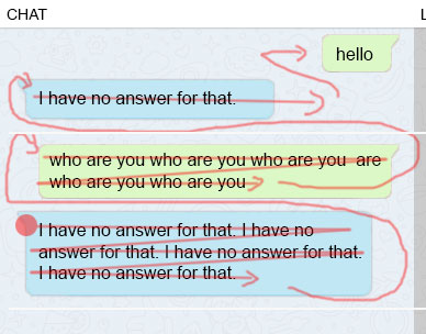
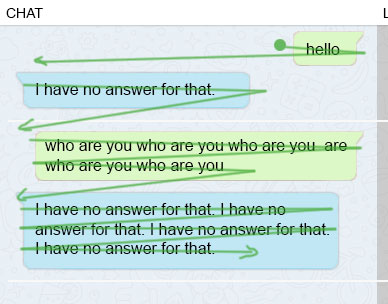
Yes, I agree, chat balloons seemed like a good idea, but when I tried I saw that the texts were very separated, it works in the vertical view on the cell phone, but if you put it horizontal the same thing happens on the cell phone. Large eye movements should always be avoided. I tried to make it better understood by adding the lines, but failed.
What do you think now?
Trying to narrow the width of the chat, the typography is a little bigger. Time to the right to complete the space and to serve as a guide, I suppose it can be done.
I added a single "More info" button that pulls down the information for both.
More info open:
It could have one scroll each or it could be all one.
This version with the chat in order from top to bottom, like whatasapp.
The right column with "12:42:51" could perhaps be used to put a link that opens the Debug Tab with that line highlighted or something similar. Just an idea to give that column some functionality.
If it's still confusing, let's leave the current chat as it is. We may come up with other ideas later.
All great progress!! I
All great progress!!
I haven't said anything yet but I am reading and following.
Astro, the right column with "12:42:51" should be the debug, I use a lot the debug along with the chat to compare where errors are located and what should be modiffied in the aiml.
Thanks Gael, What do you
Thanks Gael,
What do you think of this?
Version 8
This could work with only the left side for the Tabs, Chat, Edit, Bot Properties, Predicates and the Debug always on the right.
Or that all the bottom part changes being the first Tab Chat-Debug, and in the others the full width would be used.
I was thinking that it has a
I was thinking that it has a logical side if we do it the other way around.
With the Bot on the left side, I think it would be better to have the Debug on the left, So it would be the "mechanical" side and have the Chat and whatever is more interactive "human" like chat and editing the properties on the right. I don't know if it seems practical to use it that way.
I leave you a lot of versions to polish the good and the bad, graphic and minimalist.
Version 9
@Gael, I did the "git push" of the SideNav button, The button size will fit the text.
I didn't know where to put the png and put it in / service / views
tell me what you think.
Between the 4 I like the top
Between the 4 I like the top .... the good one right? ;)
I as a noobie probably can figure out what (Bot Properties) are ... I sure as heck wouldn't know what (Predicates) are...
Now since I dived into the details ... they are user session properties, so on the UI I think User Properties .. or 'maybe' Session Properties would be more useful. They are specific to on relationship between some user & some bot so they are not really global user properties like Bot Properties are.
Great propositions Astro! I
Great propositions Astro!
I follow the proposition Grog likes.
robots shouldn't forget after a session.
bot properties are exactly that.. global.. things like the bots name, birthday, favorite food... bot specific properites.
bot properties can be accessed through the "bot" aiml tag.
https://callmom.pandorabots.com/static/reference/#elements/-lt-bot-gt-
user properties are things the bot learns about a user across all sessions that the bot has with that user.
user properties are accessed through the "set" and "get" aiml tags.
https://callmom.pandorabots.com/static/reference/#elements/-lt-set-gt-
https://callmom.pandorabots.com/static/reference/#elements/-lt-get-gt-
Something very weird happened
Something very weird happened to me with Mr. Turing and I didn't want to continue his conversation.
Well, it was a long day, but I managed to make it look pretty similar to what I did in photoshop.
I was testing the chat and I was trying to speak in English all day (my pronunciation is not very good) I was talking to him and I was still speaking in English even though I wasn't testing it at the time.
I was doing the last tests and I see that something was wrongly positioned in css, I said "no no that is wrong" without thinking that he was listening to me and when I corrected it, I said "Now we are talking".
I didn't realizing that he is listening, because I don't know if you are fixing something of the voice in brain, because I don't hear him speak, only when I type in "let it speak" field or when starting, he only responds with text when i talk to him, maybe I have to do a clean installation again.
So I didn't realize that he was asking me to replace the answer and I kept talking while looking at the code and then when I go to see the chat I found this:
"we are touching!"
WTF! haha.
So how do I correct this situation now? haha.
I have to learn how to edit the AIML, but there is no way to search "no no" in the GUI.
If I go to the last line in learnf.aiml which is where I think the last thing learned should be, I can't find that.
[INFO] Matched: LEARN NEW RESPONSE * <THAT> * <TOPIC> *
_inmoovKnowledge.aiml
I did not find there either.
I searched with SublimeText of the entire c: \ dev directory for "we are touching" and only found it in the log file.
I'm lost in this and you guys make it look so easy.
Ahahhahah ... :D You taught
Ahahhahah ... :D
You taught him to understand .. no really means yes ;)
Pretty sure it would be in the predicates? in the conf/{name}.predicates.txt file ...
not positive though ..
Try searching in ProgramAB repo, make sure your search is case insensitive.
You can always check in what you have .. then start a new make_web_dev.bat
But that might really hurt his feelings ... be gentle ;)
I'm having trouble and can't
I'm having trouble and can't find a reason.
When I use it in i01.chatBot "More info" works fine
but if it is inside the InMoov interface i01, it doesn't work.
But actually something "works", because if you click in "More info" while in i01, when you go to i01.chatBot it appears open. I thought it might be a conflict with the id of the div, so I changed to class name but it doesn't work either. Something on the InMoov side is interfering.
I tried angular but I didn't like how it appeared and disappeared instantly taking place and moving everything down and I tried doing it with java script so that it has a transition showing the div below the top table and trying that everything remains on the screen without a scroll that sends the "Save Config" button below.
I'm going to do a push so you can see.
Great job Astro on the UI,I
Great job Astro on the UI,
I just tested it and it is really nicely understandable.
@Grog, having the editor for the AIML is a great plus. As you noticed some AIML files contain more than 4000 lines, do you think it would be possible to add a word search within the editor?
I know you mentionned adding the save button has given you a lot of trouble, so if a search is too difficult, forget about it, there is more other important stuff to fix.
Hi Gael, #1 There already is
Hi Gael,
#1 There already is search in the edit - it has to have focus - ie the cursor must be inside the edit box, and you hit CTRL-F. Appears to be working for me.
Astro,
Thanks for making the windows longer, I like the grouping ! And the chat box looks great !
Its good to have scroll on the bottom windows, but can we remove the scroll on the #2 "More Info"? I opened it can cannot close it without refresh.
These should just push down everything else .. with ng-hide or ng-show. They are like a view that would rarely be used. Just something advanced users might check very occasionally. There also replicated in the tabs below in edit form (Bot Properties & Session Properties)
Also I think its useful to have the bot description back in the same box as the locale. We can certainly make the description much shorter, but something to quickly summerize a bot it useful there.
Thanks Gael and Grog! can we
Thanks Gael and Grog!
can we remove the scroll on the #2 "More Info"? I opened it can cannot close it without refresh.
So something is blocking javascript like inside InMoov gui.
Ok. I'm going to look how to do it with ng-hide or ng-show.
bot description back in the same box as the locale
I had minimized it to the maximum so that it is within the InMoov gui, but now I can think about it from service point of view and we can expand to put more information.
Right ! Its a good strategy
Right !
Its a good strategy to always think & design with the service gui and only after the service gui is designed correctly ...
Then, think how gui within gui will work.
ng-show can be useful possibly to programmatically reduce sections when its in a gui-inside-gui context
can we remove the scroll on the #2 "More Info"? I opened it can cannot close it without refresh.
So something is blocking javascript like inside InMoov gui.
Ok. I'm going to look how to do it with ng-hide or ng-show.
I was testing outside of InMoov - the regular service gui for ProgramAB .. i couldn't close it because i couldn't reach the button
@Grog, I tested #1 There
@Grog,
I tested #1 There already is search in the edit - it has to have focus - ie the cursor
must be inside the edit box, and you hit CTRL-F. Appears to be working for
me.
It works for me too. Who would know that but you. :)
We definitely need to have something that mentions the option somewhere. Maybe a title line?
It works for me too. Who
It works for me too. Who would know that but you. :)
Heh, good point.
added, commited, pushed webgui_work
Very cool!
Very cool!